Every brand has a story, but at athme, our story is woven directly into our logo, a visual identity designed to inspire, connect, and reflect the real experiences of athletes and sports enthusiasts everywhere.
A Logo Inspired by Nature's Challenges and Triumphs
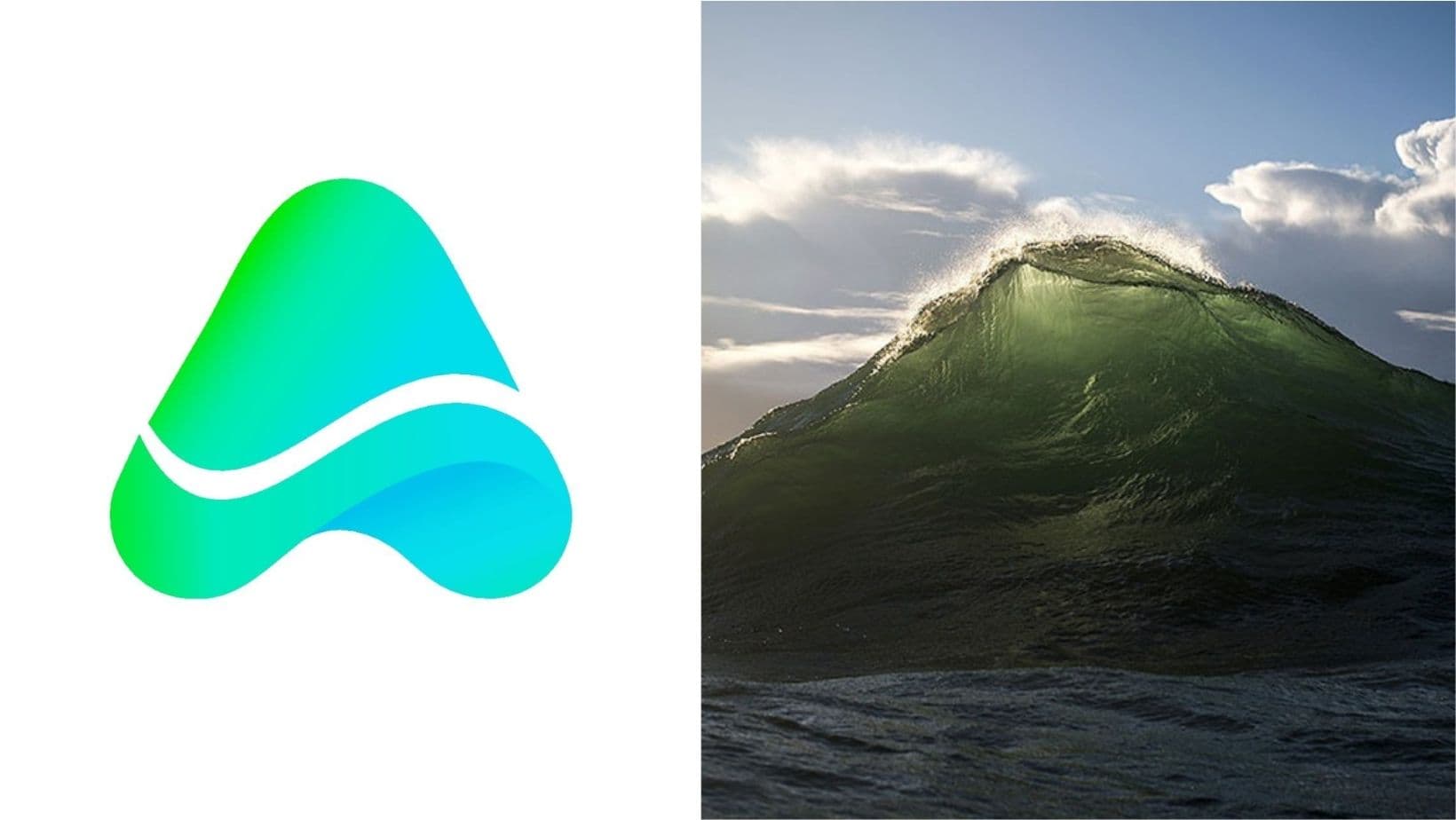
At first glance, the athme logo is striking: a bold "A" that fuses the silhouette of a mountain peak at the top with a wave at the bottom. But what does it mean?
The Mountain Peak stands for ambition, challenge, and the satisfaction of reaching new heights. Just as climbing a mountain is tough, demanding perseverance and grit, the journey to mastering a new sport or building a community is filled with obstacles. But when you reach the summit, the view is worth every step.
The Wave below the peak represents movement, adaptability, and the natural rhythm of progress. Waves remind us that growth isn't linear. There are ups and downs, moments of flow and resistance, but each one moves us forward.
Together, the mountain and wave capture the emotional highs and lows, the real, raw journey that every athlete and community builder experiences.
Colors That Tell a Story of Growth
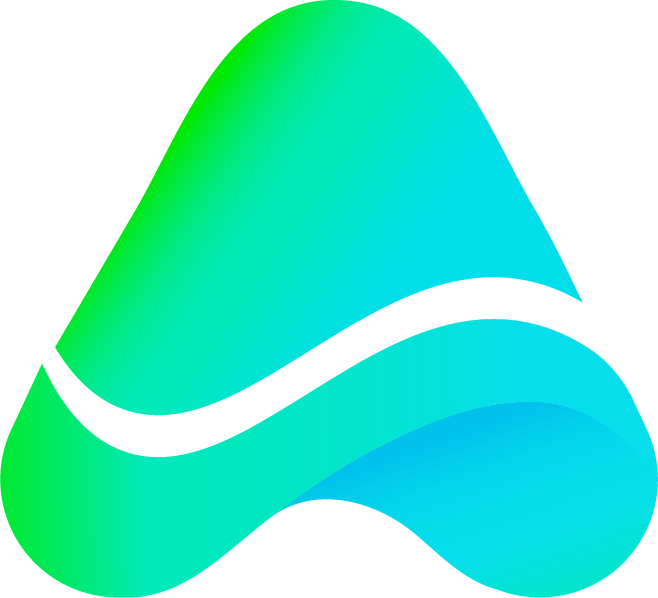
The athme color palette isn't just about aesthetics. It's a journey in itself:
Blue marks the beginning, the discovery phase. It's the color of curiosity, trust, and the courage to step into something new, whether that's joining your first pick-up game or hosting your first event.
Green emerges as you grow, symbolizing harmony, confidence, and mastery. As you gain experience, build connections, and become part of the athme community, the palette shifts to vibrant greens, reflecting your evolution from a newcomer to a confident player or organizer.
This gradient mirrors the path every athlete takes, from the excitement of starting out to the fulfillment of becoming skilled and connected.
Why This Matters for Our Community
athme isn't just a platform, it's a movement to bring people together through sports, making it easier to find your tribe, organize events, and create meaningful experiences. Our logo is a daily reminder that:
- Every journey has ups and downs, but progress is always possible.
- Growth comes from embracing challenges and celebrating every win, big or small.
- You're never alone, athme is here to support, connect, and empower you at every stage.
A Platform Built on Real Connections
Just as our logo blends the mountain and wave, athme blends technology and community. We're not just an app; we're a new way to experience sports, where every player, event host, and venue owner is part of a bigger story.
Join us. Start your journey. Reach your peak. Ride every wave.
"The A shape represents the starting point, the beginning of an adventure. Each wave within the A symbolizes the dynamic energy and fluidity of movement, echoing the vibrant activities within the app. The gradient portrays the journey from one shade to another, mirroring the diverse experiences users will encounter while connecting through the app. The blend of blue signifies depth and trust, while the touch of green represents growth and harmony within the community. Together, these elements embody the essence of athme: a platform where individuals converge, explore, and forge lasting connections through shared passions and pursuits." - athme Brand Identity